







What Is Brand Identity?
Ask five people in the same company to describe their brand, and it's common to get five different answers — one talks about the logo, another about tone of voice, another about the mission statement. Brand identity is not any single one of these things. It's the deliberately designed system that holds them all together, so that whether a customer sees a website, an email, or a branded gift on their desk, it's unmistakably the same company speaking.
This guide defines brand identity clearly, distinguishes it from related terms that get used interchangeably, and explains why physical, tangible touchpoints — including promotional products — play a bigger role in reinforcing it than most marketing teams give them credit for.
What Brand Identity Actually Means
Brand identity is the collection of visual, verbal, and experiential elements a company deliberately creates to represent itself: logo, color palette, typography, tone of voice, imagery style, and the physical materials that carry all of these into the world. It is the input — what the company designs and controls — as distinct from brand image (how customers actually perceive the company, which the company doesn't fully control) and branding (the ongoing activity of building and applying that identity consistently).
A useful way to separate the three:
| Term | What It Is | Who Controls It |
|---|---|---|
| Brand Identity | The designed visual/verbal system (logo, colors, voice, materials) | The company |
| Branding | The ongoing process of applying that identity consistently | The company |
| Brand Image | How the audience actually perceives the brand | The audience |
A strong brand identity, applied consistently through branding activity, is what gives a company the best chance of shaping brand image in the direction it intends — but image is always, ultimately, formed in the customer's mind, not dictated by the company.
The Core Elements of Brand Identity
- Logo and logo variations — the primary mark, plus approved variations for different contexts (single-color, icon-only, horizontal/vertical lockups).
- Color palette — a primary and secondary set of colors, used consistently enough that the colors alone become recognizable.
- Typography — a defined set of typefaces for headlines, body text, and any Arabic/multilingual equivalents, so type doesn't drift page to page.
- Imagery and photography style — a consistent visual tone (bright and minimal vs. warm and textured, for example) across marketing materials.
- Tone of voice — how the brand sounds in writing, from formal and technical to warm and conversational.
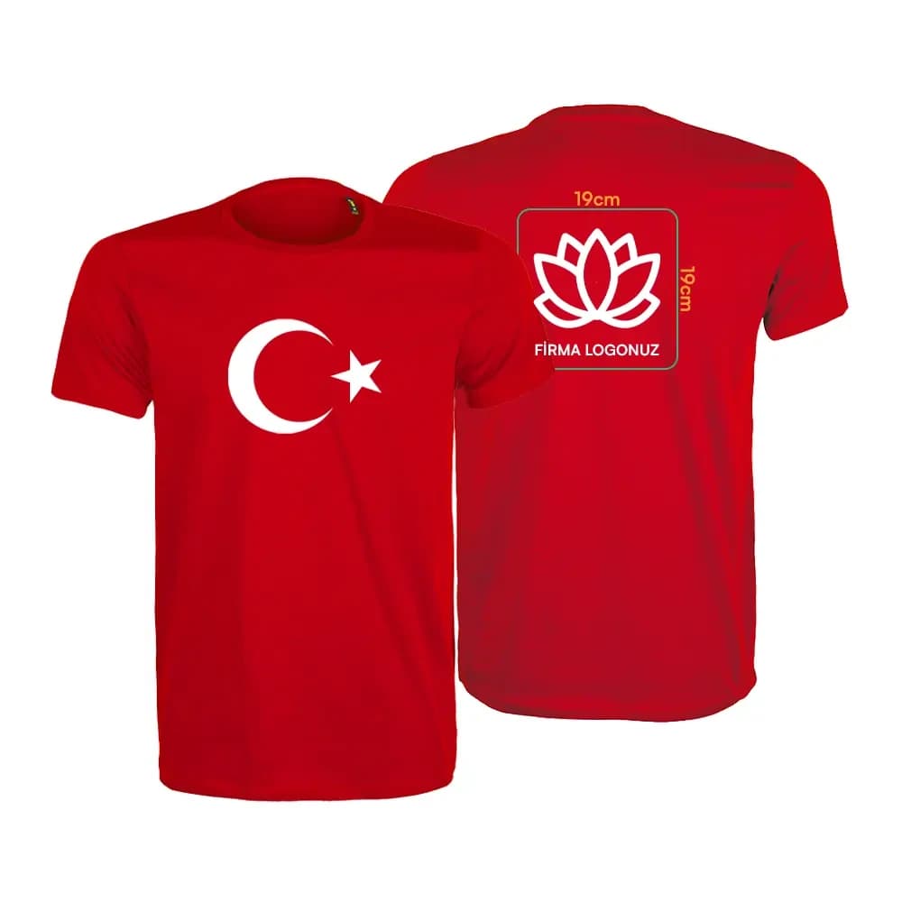
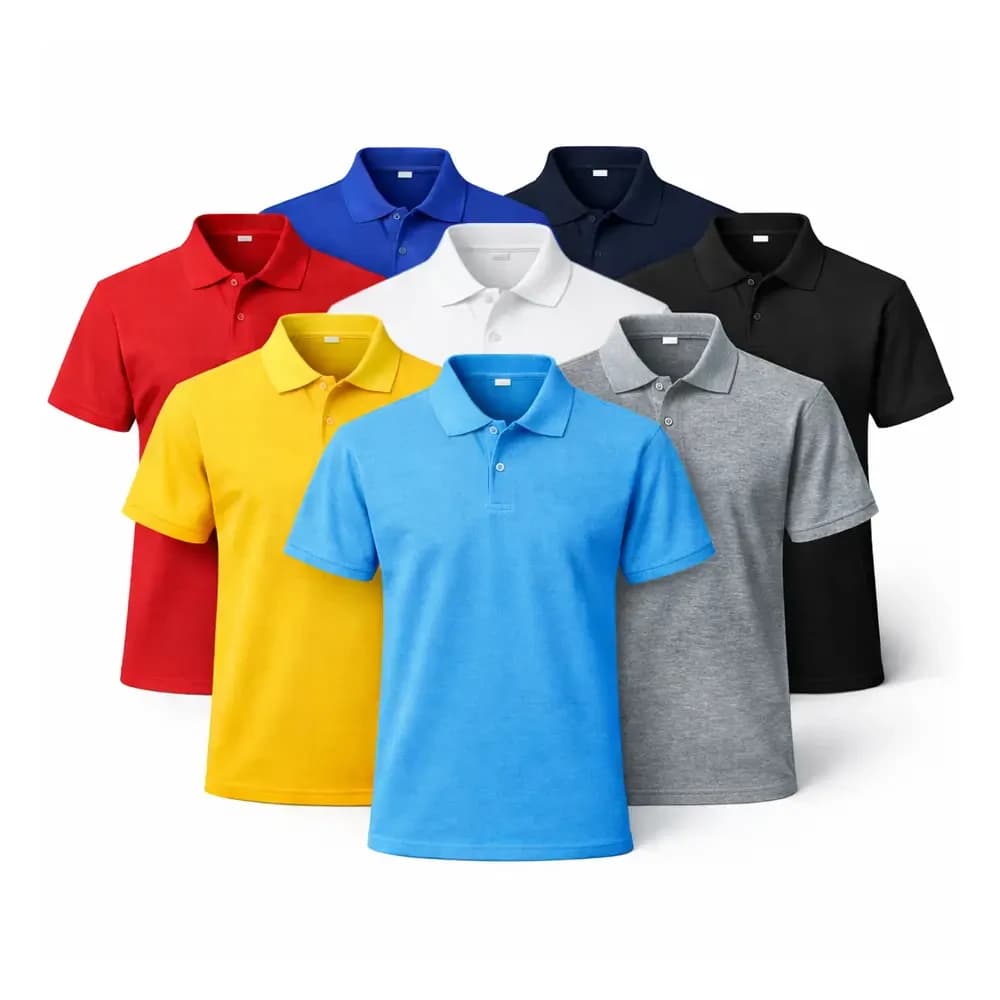
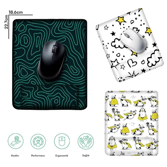
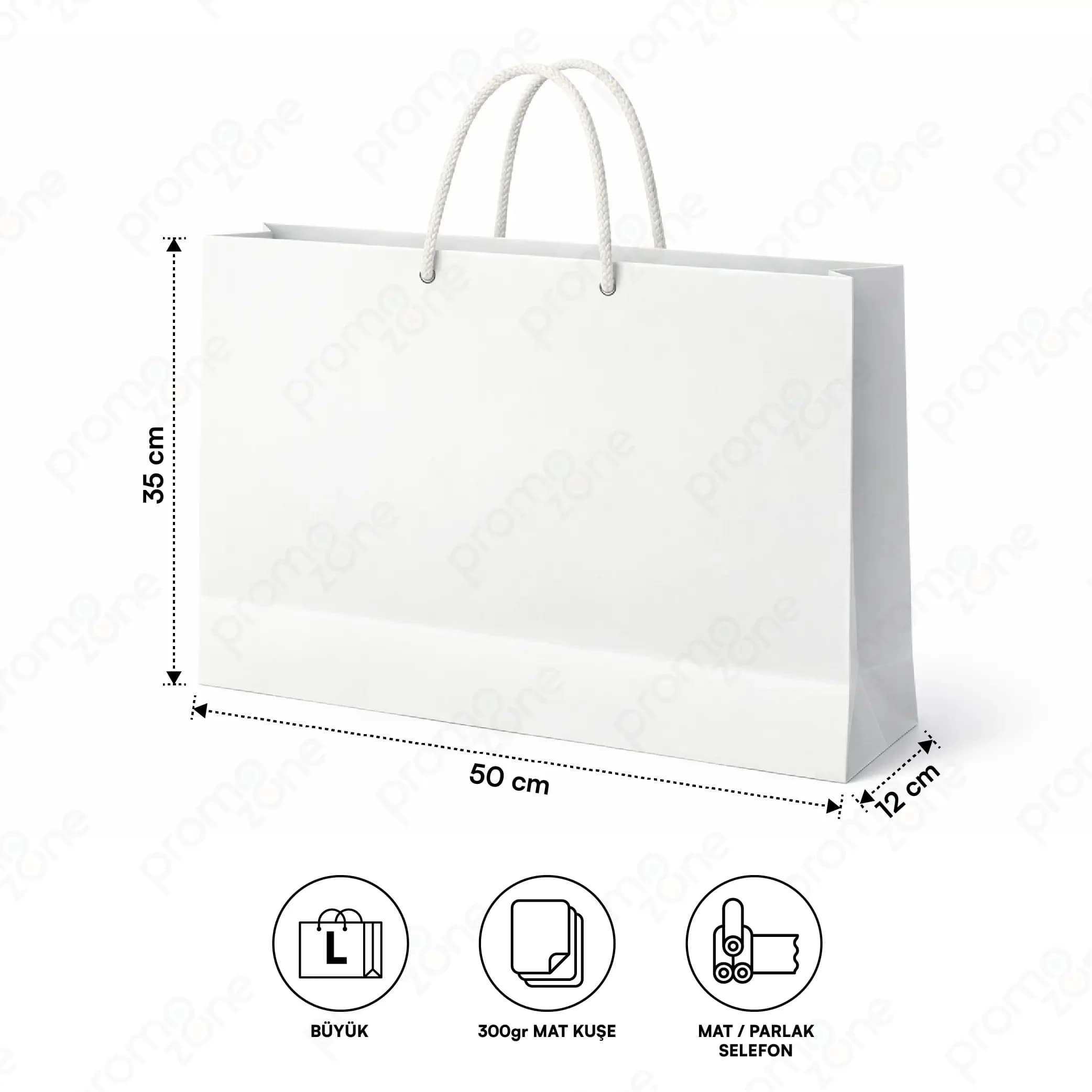
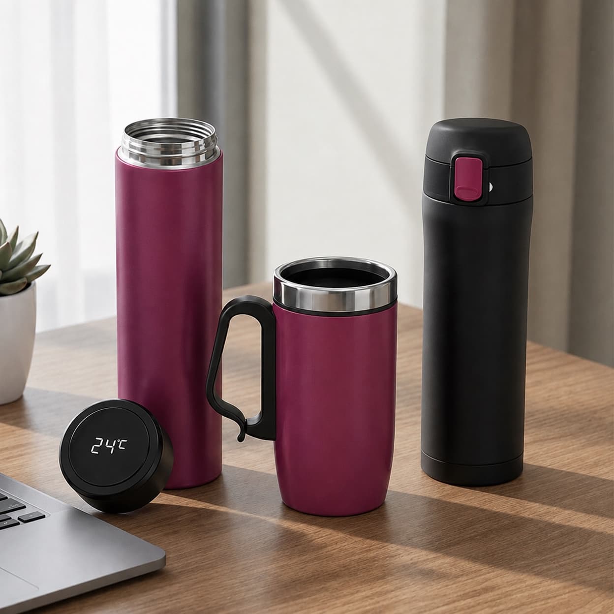
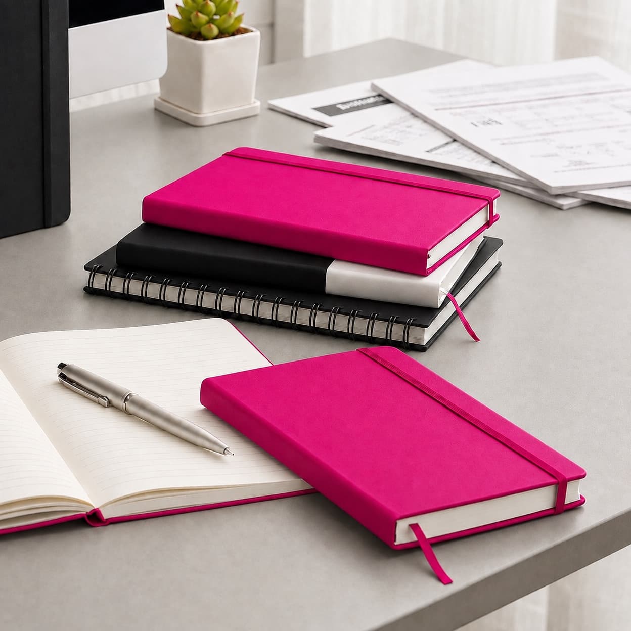
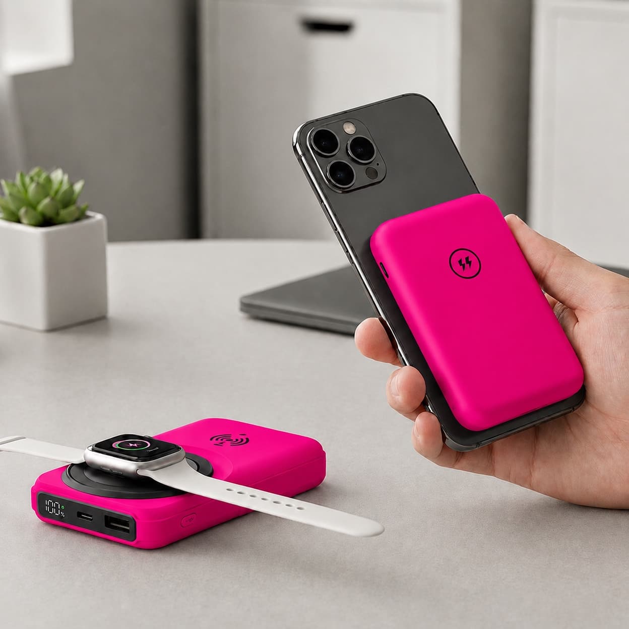
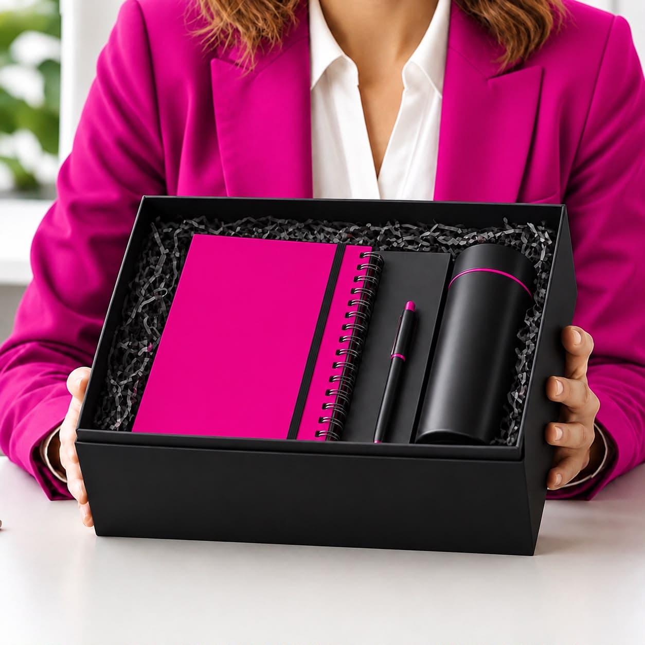
- Physical brand touchpoints — packaging, print materials, and promotional products, which are often the most underused element of the system despite being some of the longest-lived.
Why Physical Touchpoints Matter More Than They're Given Credit For
Most brand identity discussions focus on digital assets — websites, social templates, email signatures — because they're the easiest to standardize centrally. But a branded notebook, pen, or drinkware item sitting on someone's desk for a year is a brand identity touchpoint too, and arguably a more durable one than a social post that disappears from a feed within hours.
This is exactly where brand identity and promotional products intersect directly: a pen with a slightly-off logo color, or a notebook using a typeface that doesn't match the website, quietly undermines the same consistency a marketing team may have spent months building into their digital guidelines. Logo placement, color accuracy in printing, and material choice all need to follow the same brand guidelines as any other customer-facing asset — see our guide on logo placement on promotional products for the specifics.
A Practical Example
A regional bank rebranding from a traditional navy-and-gold identity to a more modern teal-and-white palette rolled out new digital assets within weeks — website, app, email templates — but continued distributing three-year-old branded pens and notebooks in the old colors at branch openings for months afterward, simply because no one had flagged promotional inventory as part of the rebrand checklist. The inconsistency was minor individually, but cumulatively it meant a meaningful share of the bank's physical brand touchpoints were actively working against the new identity during the exact period brand recognition mattered most. Treating promotional product inventory as a brand identity asset — reviewed and refreshed alongside digital guidelines — closes this gap.
Building Brand Identity: A Practical Checklist
- [ ] Is there a single, documented brand guideline covering logo usage, color codes (including print-specific values like CMYK/Pantone, not just web hex codes), and typography?
- [ ] Do physical materials — packaging, print, promotional products — follow the same guideline as digital assets?
- [ ] Is there a process for reviewing promotional product inventory when the brand identity is updated?
- [ ] Does the tone of voice guideline extend to product packaging copy and gift messaging, not just marketing copy?
- [ ] Are Arabic and English brand assets (typography, tone) reviewed together, rather than one being an afterthought translation of the other?
In Summary
Brand identity is the designed system, not the perception it produces — and that system extends well beyond the digital assets most guidelines focus on. Physical touchpoints like promotional products, packaging, and print materials carry the brand into daily life for months or years at a time, which makes consistency there just as important as consistency on a website.
Need your branded products aligned with your identity guidelines? Pen Promo's production team works from your brand guidelines to ensure color and logo accuracy across every printed item — request a quote or browse Printing Services.
Need Help Choosing the Right Promotional Product?
Get a free, no-obligation quote from our team.
Frequently Asked Questions
No. A logo is one element of brand identity, but the full system also includes color, typography, voice, imagery, and physical material choices. A strong logo with an inconsistent supporting system still produces a weak overall brand identity.
There's no fixed timeline — some brands refresh subtly every few years, others go a decade with minimal change. The more important discipline is consistency between updates, not the frequency of updates themselves.
Yes, arguably more than large companies, since smaller teams are more likely to have different people ordering print materials, promotional products, and digital assets independently, without a shared reference to keep them aligned.